

Posts on Current Forum | Archived Posts
|
|
|
||
|
||||
|
||||
|
||||
| Frequently Asked Forum Questions | |
|||
|
||||
|
|
|||
| ||||
| ||||
| ||||
| Search Older Posts on This Forum: Posts on Current Forum | Archived Posts | ||||
| ||||
| ||||
| ||||
| *IMG* *SPOILZ* | |
| Posted By: TelTura <hyperlink.teltura@gmail.com> | Date: 4/24/07 10:51 p.m. |
|
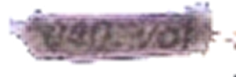
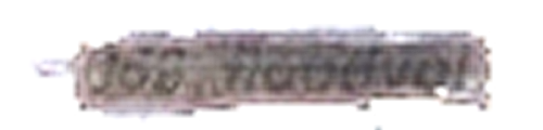
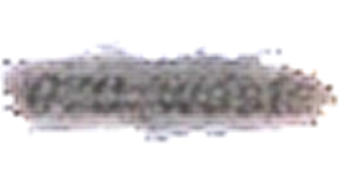
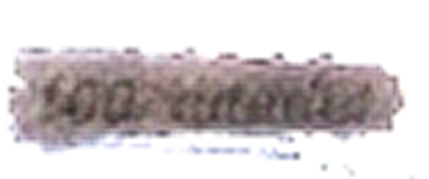
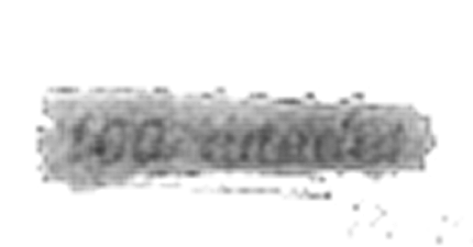
heh, I work at a UPS store, so I'm always having to block out bar codes and so on with thick, black markers, and the first thing I thought of when I saw the marker blackout (as opposed to a digital one), was that those images were screwed. it might fool computers, but no amount of regular marker will fool a human. i'm just annoyed that I wasn't the first to get my results up....oh well. but at any rate, I use something better than mspaint (aherm) and I messed with the brightness and contrast of each one, before I blew them up to 500% using the default smartsize, and then running a high-pass sharpen, resulting in these barely readable images:
now, the last one is still basically unreadable:
I've tried various things like "cortana" "attack" "cutscene" "outskirts" and nothing seems to fit. For anyone else who would like to give it a shot, the font that they use is Arial, italicized, and when I did it was ~11pt font. yes, I actually overlaid text on top of it; it worked smoothly for "waste" and so on, and perfectly for "030_outskirts" on the first page, which was how I figured the font style. I also tried splitting the image to RGB, and found that the red was slightly clearer.
i'm still stumped on that last one, but maybe this will help others.
| |
|
| Replies: |
The HBO Forum Archive is maintained with WebBBS 4.33. |